I was brought in to design an app. Mindmapping, flows, assets, the entire thing. On paper, it was a habit and to-do app. Another one in a crowded category.
But the real ask was different. The team wanted to build a long-term home for people with ADHD to manage their lives. Not a productivity tool. A place the users would actually come back to.
Those 4 letter acronym changed everything. Because the moment you say "for ADHD," you cannot design like you would for a neurotypical user. The whole playbook shifts.

Going to the horse's mouth
I did not start with any design process. I started by reading.
Couple of research papers on ADHD understanding why rewards, novelty, urgency, and immediate feedback work differently in ADHD brains. Learned something I knew but could never articulate earlier. ADHD is not a focus problem. It is a motivation problem, rooted in how the brain processes reward. People with ADHD have lower dopamine receptor density in the parts of the brain that handle reward and motivation. This means future rewards feel less real. A goal three weeks away barely registers. The brain discounts it. Researchers call this "delay discounting." The ADHD brain would rather take a small reward now than a bigger reward later. Not because it lacks discipline, but because the neural machinery that makes future rewards feel worthwhile is running on less fuel.
That was the unlock. But papers only got me halfway.
I went to Reddit. r/ADHD, r/adhdwomen, r/productivity. I read threads for hours. What people actually said about habit apps. What made them quit. What made them stay. The language was unfiltered and it told me things no paper could. The pattern was clear. Every app they had tried assumed motivation was internal. Every app had failed them. They were not lazy. They were being asked to run on fuel their brain does not produce.
The new design problem
Once I saw it this way, the brief rewrote itself.
I was not designing a habit tracker. I was designing a dopamine delivery system. Every interaction had to give the brain a small, immediate reward. Every friction point had to be removed, because friction in an ADHD brain compounds fast. And the app had to bend to the user, not the other way around. People with ADHD live unpredictable days. A rigid system would get uninstalled within a week.
Reward the moment, not the outcome. Celebrate the tap, not the streak. Customisation is not a feature. It is oxygen. Every habit, reminder, and flow had to bend to be flexible. Never make the user feel out of control. Missed days should not make them feel guilty.
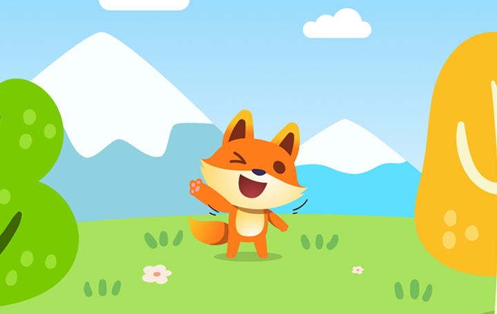
The fox
The mascot was not a decoration. It was the product. I chose a fox for a specific reason. Foxes are clever, not disciplined. Every other productivity mascot signals grind, structure, seriousness. A fox signals wit. It tells the user you do not need to be rigid to succeed. You can be quick, adaptive, a little chaotic, and still get where you want to go.
That message matters. Because most ADHD users arrive at productivity apps already carrying shame. They have tried and failed with tools built for brains that are not theirs. The fox is the first thing that tells them this place is different. You are not broken. You just needed a tool that understood you.
When you check off a task, the fox jumps and throws confetti. That moment is doing real neurological work. It is an external dopamine trigger, delivered at the exact instant the brain needs it most. Timing is the design.
Where the work got hard
The hardest part was not the mascot or the research. It was customisation. Every feature I built had a tension of making it flexible enough to fit any ADHD brain, but simple enough that no one would rage-quit during setup. Too rigid and users felt punished. Too open and they'd feel overwhelmed.
I spent weeks on this. Each feature had to pass both flexibility and simplicity tests. Reminders, habit types, tracking cadence, all of it. The final system lets users bend the app to their life without making them design it themselves. This was the quiet work. No user ever says "I love your customisation depth," they just keep using the app.
Did it work out?
Habit Eazy sits at 4.6 ★ across 1.24K reviews and over 100,000 downloads. But the metric that matters most to me is the referral rate. People are telling other people about it. When I read reviews, I see the fox mentioned by name. I see people describing the app as "cute" and "ADHD-friendly" in the same breath. I see reviews from users who say this is the first habit app that ever stuck.
The fact that people with ADHD, the demographic most often let down by productivity tools, found a home here.
The real problem is almost never the one written in the brief. The problem was that every app is designed for masses to improve their top of the funnel but never for the ADHD group specifically.
If I had started with flows and screens, I would have built another forgettable app. Starting with the brain, the research, and the Reddit threads is what made it different. Good design for a neurodivergent audience is not about adding features. It is about removing the assumption that the user should adapt to the tool. The tool adapts. Every time.